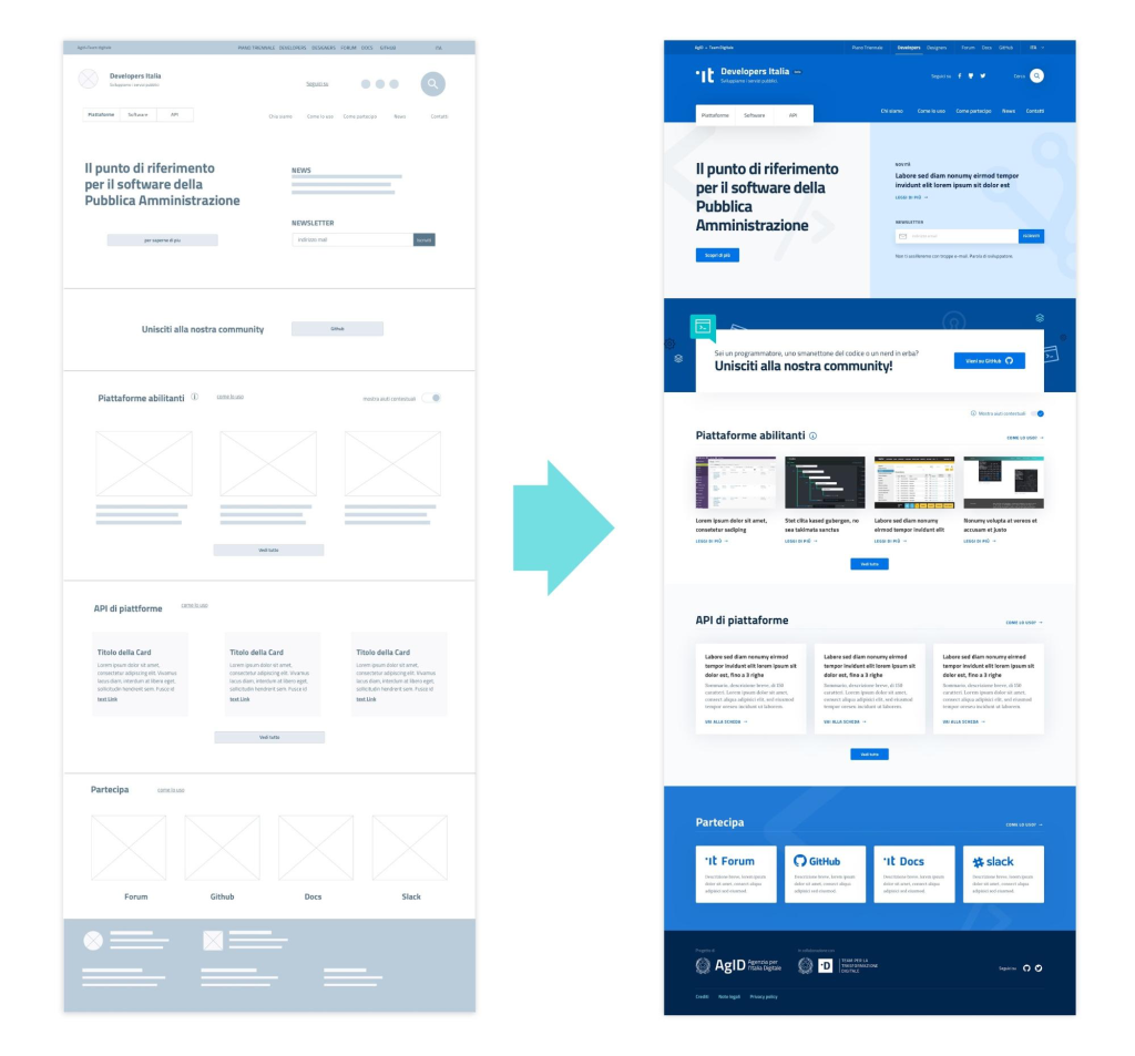
| The “high-fidelity” (hi-fi) interface design is the final phase of design that focuses on visual design aspects, adding details, style, and animations. The interface is built using the wireframe containing the general structure of the product as a reference point: the skeleton is transformed and enriched to give a real rendering of the final product, although it still lacks all the user interaction elements that will be implemented during the development phase. |
 |
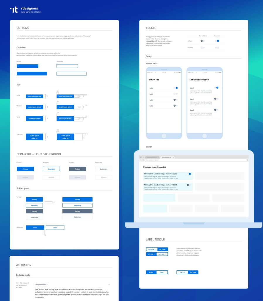
| The UI Kit provides a library of ready-made elements that can be assembled to build a user interface suitable for Public Administration services. The elements that make up the kit are grouped into the following main categories: – Typography Definition of colors and their application – Positioning and spacing, with a grid system – Icons – Buttons – Navigation elements, such as menus and link lists – Elements for displaying data and content – Data entry elements, such as text fields and form examples The construction of the elements follows a roadmap where the project can be observed and commented on during its development. Since the approach is open source, Public Administrations, agencies, and individual citizens can contribute to the discussion and modification of the UI Kit itself. |
 |
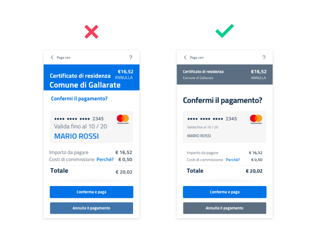
| Hierarchy serves to manage the transmission of a message and its impact, and when it is not used, communication becomes less effective. |
 |
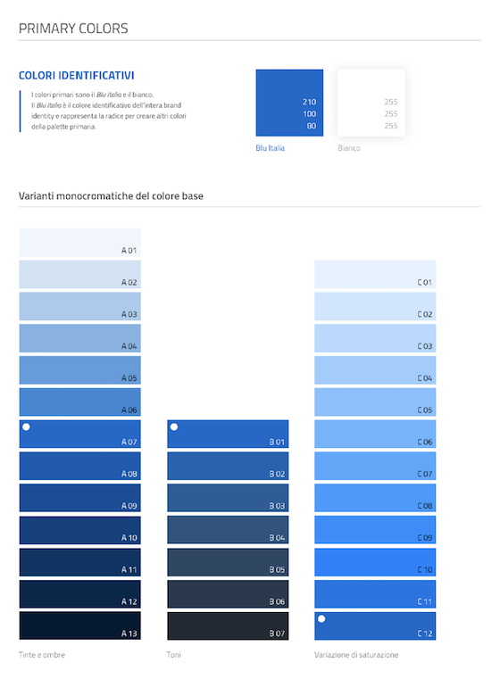
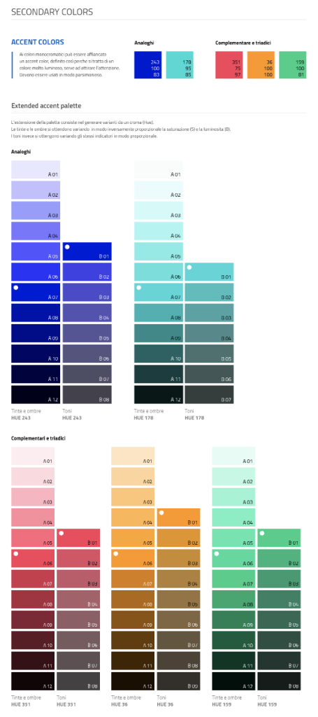
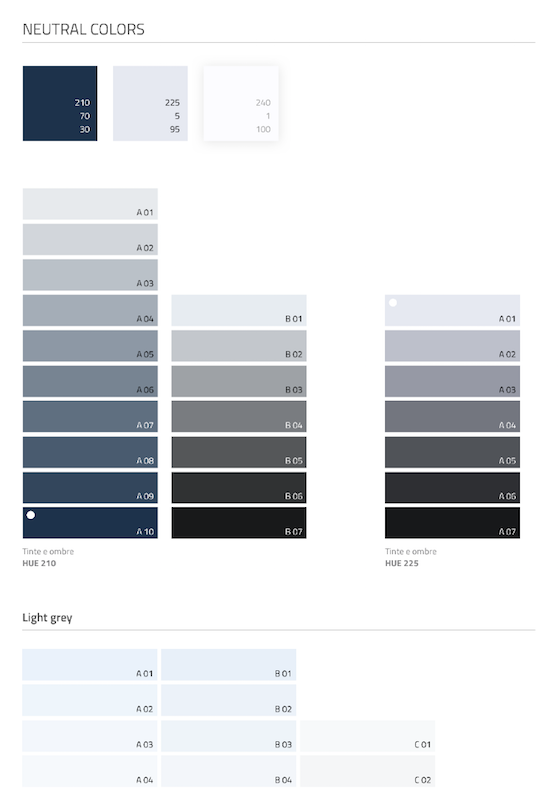
| The UI Kit’s palette is quite extensive: it includes many variations in tints, tones, and shades of the base color (“Italia Blue”), and of secondary and neutral colors, thus allowing for flexibility in use. |
 |
 |
 |
 |
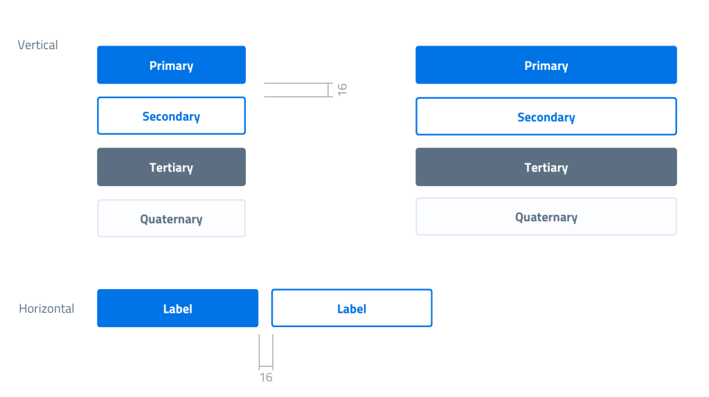
| The UI Kit contains four types of buttons, from primary to quaternary, ordered according to a hierarchical function. |
 |
| Examples: |
 |
 |
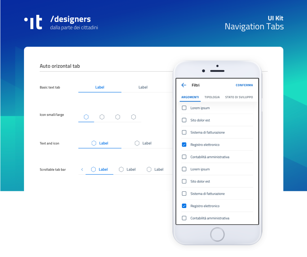
| The mobile “Menu” component shown in the following figure has some useful variants: in addition to the background difference, there is also a distinction of the menu in sections with or without headers. |
 |
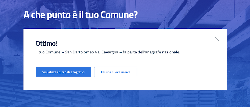
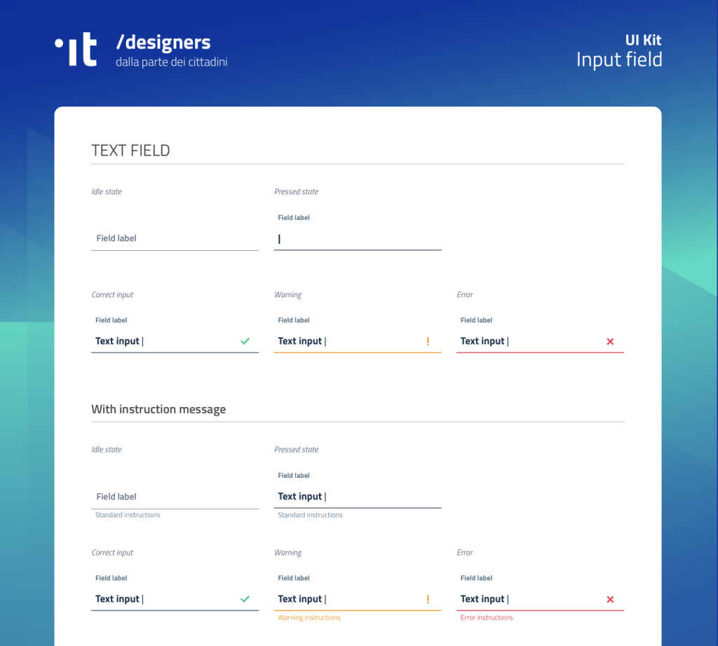
| Examples of components belonging to the Data entry category are “Input” type fields used to build forms. The component is built to enable or disable different statuses: normal, warning, error, success. The field label indicates what should be entered. When the field is activated with the cursor, the label moves up. In the component, besides feedback states managing colors and icons, related messages can also be activated. |
 |
 |