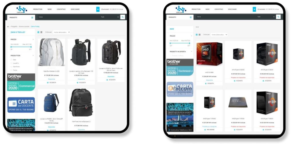
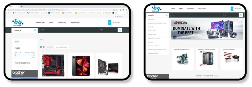
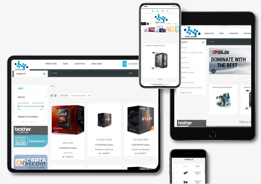
With over 5000 products the use of white space was used to let the shoppers breath and admire the products.
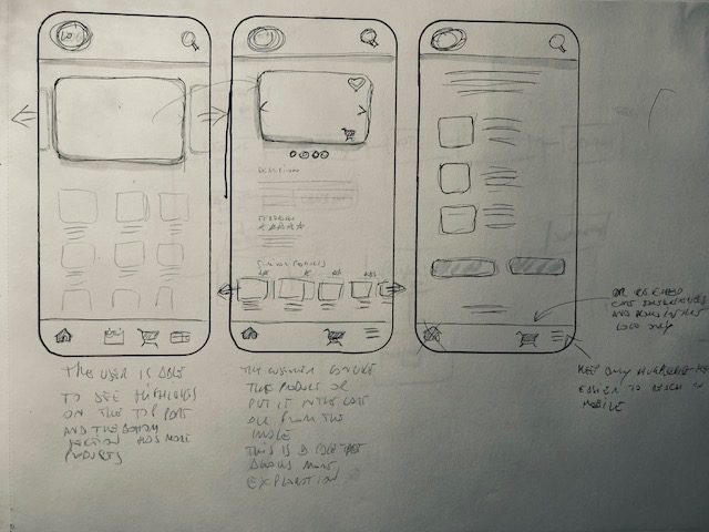
Preliminary sketches for the customer to have some visuals to discuss.
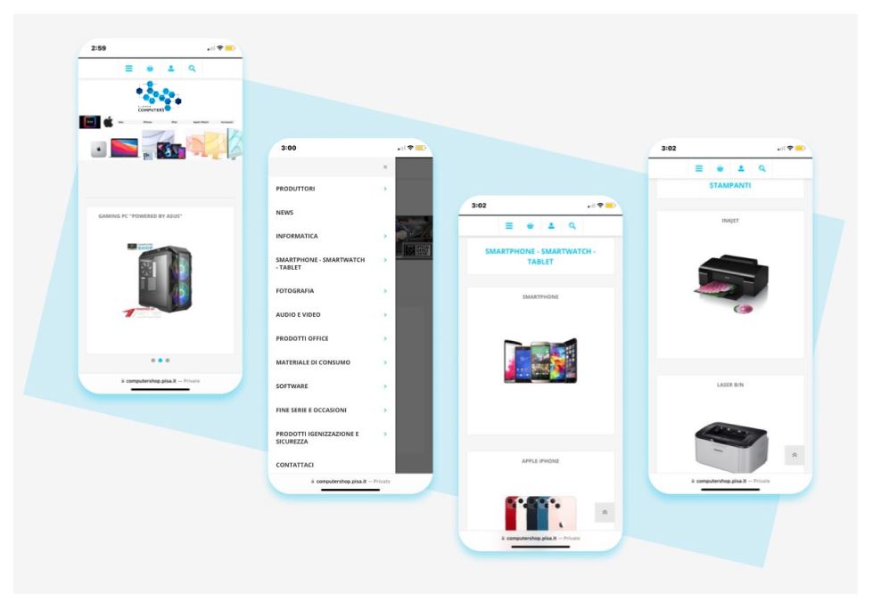
The simplified display of the items with little details give the viewers plenty of time to appreciate the product.
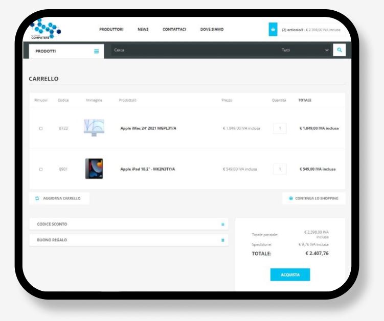
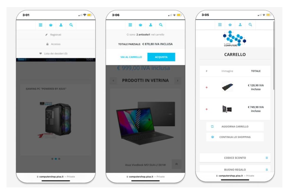
Here the journey of the customer to buy they products. Easy UI that creates no cognitive overloads.
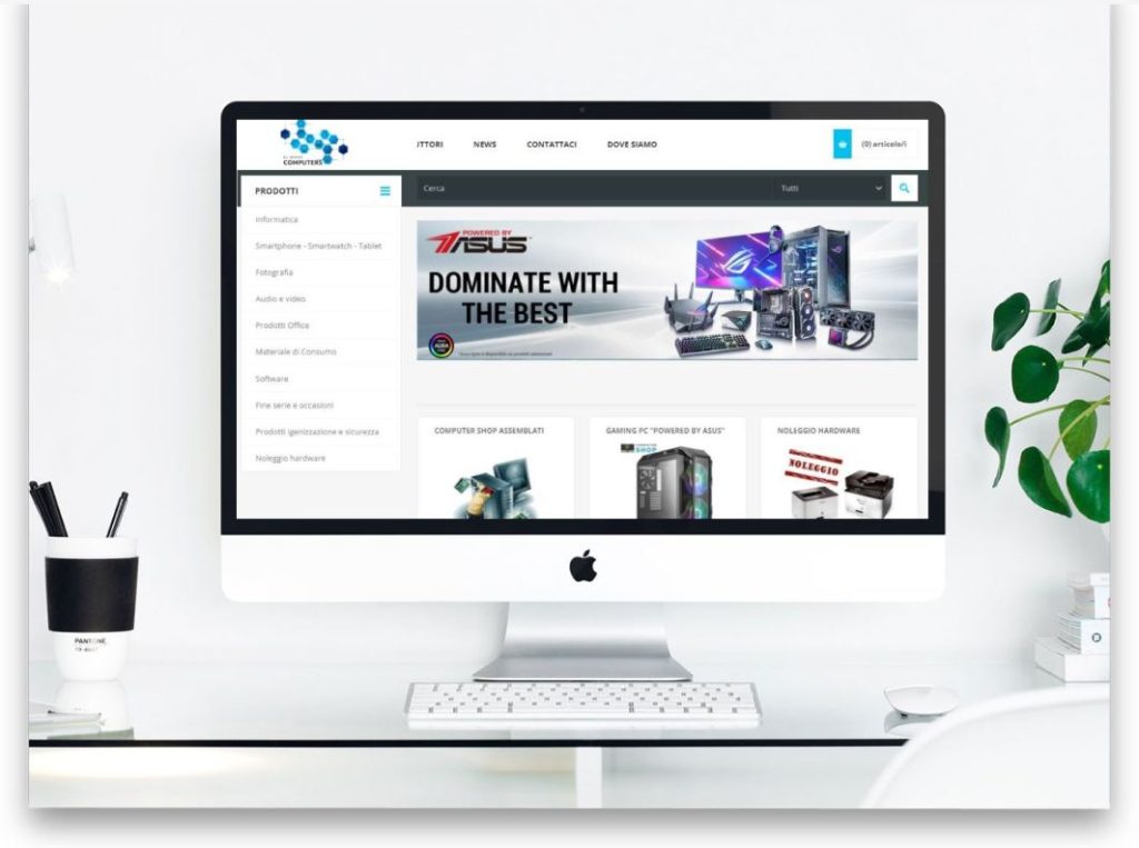
| In the website the same use of simplicity and white space create a very unique experience for the customer which usually is overload with images, description, suggestions and more. Here everything is clear and easy to digest. This particular customers has multiple physical shops in Italy and they use tablets and handheld devices on the floor when talking with clients. The tables are provided by a European company and they have very weird sizes (?!) when I asked no one could tell me why but the owner wanted to see how the website would display with the new design. |